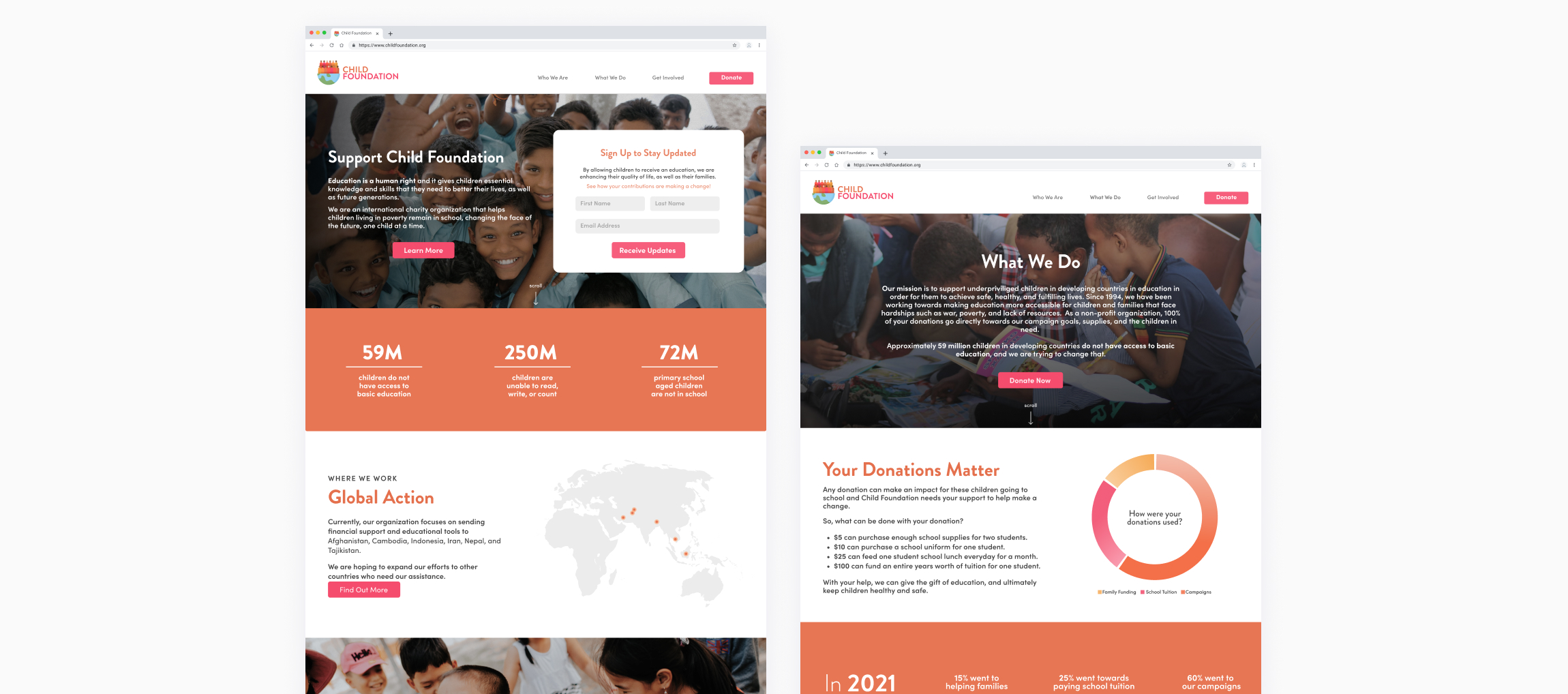
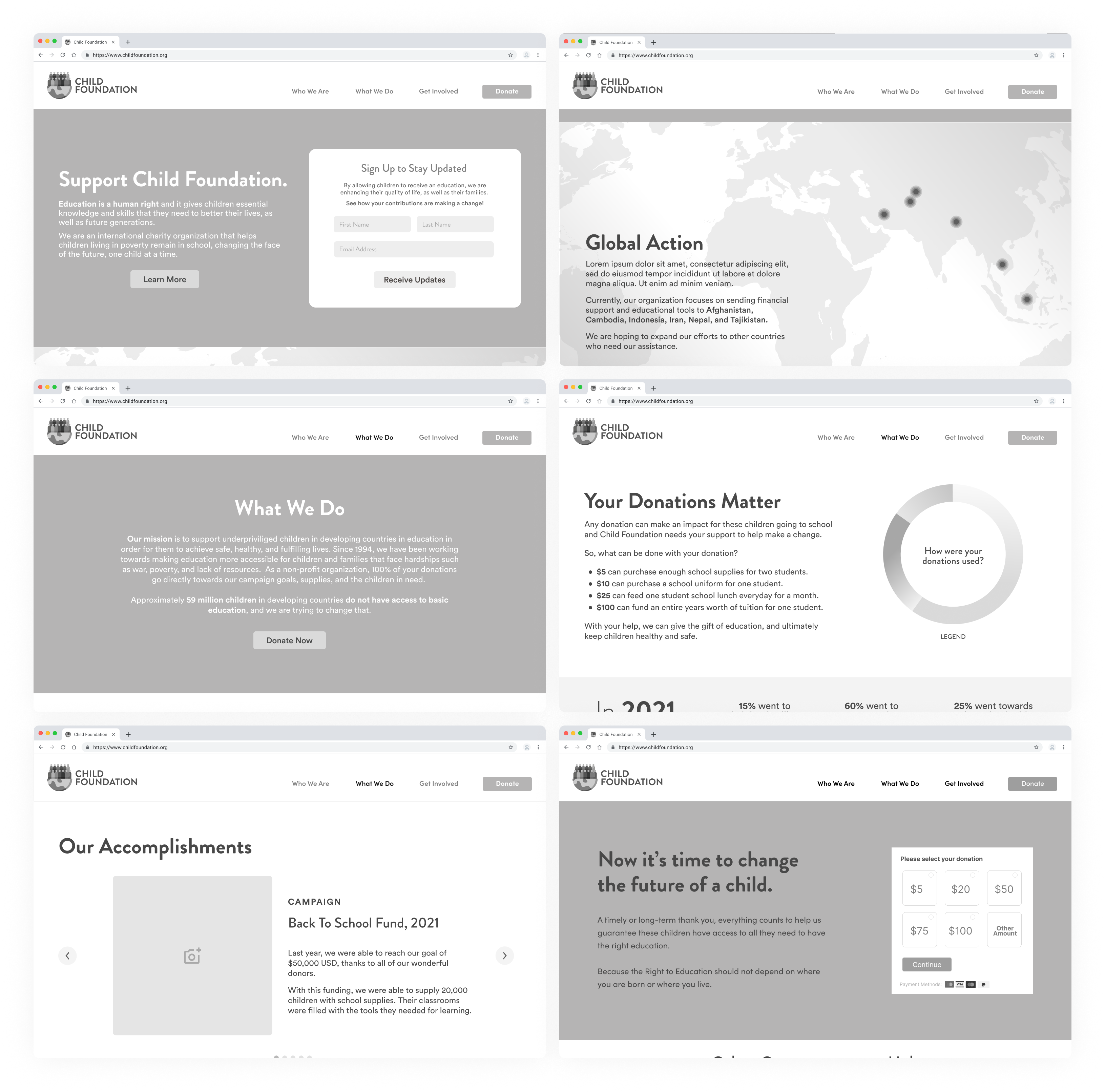
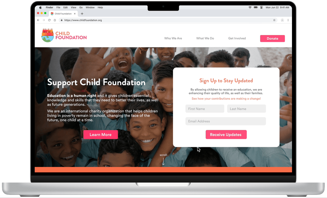
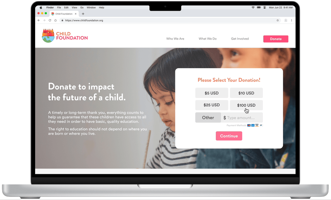
Implementing features like quantifying donation information and incorporating data visualizations (e.g., progress bars, pie charts) enhance donor trust and comprehension of impact.
CREATING MY SOLUTION
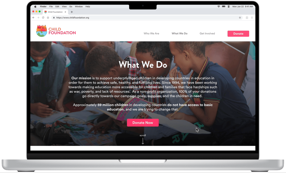
Emphasizing the utilization of donations and showcasing organizational progress became pivotal in my discoveries. By focusing on key pages like the Home and "What We Do," I aimed to present information effectively, catering to donor preferences.
AREAS OF FOCUS
My design was influenced by primary research, prioritizing user desires and needs. To create a fulfilling experience for potential donors, I focused on quantifying donation information in easily understandable terms as well as incorporating impactful data visualizations such as progress bars, pie charts illustrating fund allocation, and testimonials/endorsements.